
Your Event Category
This is an Event Title
December 30
I'm a paragraph. Click here to add your own text and edit me. It’s easy. Just click “Edit Text” or double click me.
Your Event Category
This is an Event Title
December 30
I'm a paragraph. Click here to add your own text and edit me. It’s easy. Just click “Edit Text” or double click me.
Your Event Category
This is an Event Title
December 30
I'm a paragraph. Click here to add your own text and edit me. It’s easy. Just click “Edit Text” or double click me.
Your Event Category
This is an Event Title
December 30
I'm a paragraph. Click here to add your own text and edit me. It’s easy. Just click “Edit Text” or double click me.
Your Event Category
This is an Event Title
December 30
I'm a paragraph. Click here to add your own text and edit me. It’s easy. Just click “Edit Text” or double click me.
Your Event Category
This is an Event Title
December 30
I'm a paragraph. Click here to add your own text and edit me. It’s easy. Just click “Edit Text” or double click me.
Your Event Category
This is an Event Title
December 30
I'm a paragraph. Click here to add your own text and edit me. It’s easy. Just click “Edit Text” or double click me.
Your Event Category
This is an Event Title
December 30
I'm a paragraph. Click here to add your own text and edit me. It’s easy. Just click “Edit Text” or double click me.

Subscription Flow Redesign
Context
Pogo is a community - a place to play fun games and embark on engaging challenges with friends. Club Pogo is a subscription service that unlocks a strong, unique, collection meta with a hybrid monetization model.
In general, Club pogo generates around $35m every year and makes up 34% of total Pogo revenue.
Improving Club pogo subscription will bring us more subscribers which also brings us more predictable recurring revenue.
Teammates: Matt Herrick (PM), Danielle Leasuer (Lead PM), Anoorag Biwas (Stakeholder), Matt Girard & Max Tsai (Engineer), Josh Bruff (UX content manager), EA InternalResearch Team (assisted with A/B Testing)
Timeline
05/2021 - 06/2021 (1.5 Months)
Scope
Problem framing
Concept development
Validation
Implementation

The Challenge
With the surge of the online casual game industry and a rising competitor who operates better subscription flow, our previous subscription flow struggles with our ambitious business anticipation. To redesign a better subscription flow becomes more imperative. Our ambitions were to create a solid foundation that embraces a rapidly evolving business and different types of users.
Problems
USER
V.S
-
The current user experience of the subscription flow is not effective enough.
-
The information architecture doesn't reflect on the user's goals.
-
Users don't have enough flexibility and control.
BUSINESS
-
The business report revealed that 51% of users drop off from the plan page.
-
Conversion to Free and Club is low (75% of Guest users don't convert to Free every month, 96% of Free users don't convert to Club every month).
Increase total active subscribers | improve user experience.
Long-term Goal: holistically improve user engagement experience
Convert new players from Guest to Free to Club through compelling platform upsell triggers and targeting promotions
Convert
Key club members playing by building new retention features that enhance gameplay without demanding additional spend
Retain
Primary Goals at High Level
Increase Free to Club Conversion
Increase Guest to Free/Club Conversion
Make it fast and easy for all types of users
Increase Free Trial Sign-ups (selling 'Free')
Give users more control and flexibilities of their check out selections
Bring back our At-Risk and High-Risk subscriber cohorts through targeted promotions and marketing
Engage
Key Solutions
-
Provide a simple and effective path for users to select and subscribe to the plan and reduce cognitive load.
-
Provide a full-cycle subscription journey from a holistic perspective.
-
Apply upsell and offers a strategy based on different users' stories.
Contributions
I led the project from the end-to-end process. I collaborated with cross-functional teams from a holistic perspective. I contributed brainstorming exercises to gather feedback from different contexts, competitive analysis, documented and defined user flows.
I worked with the EA internal research team closely to gather the user feedback from A/B testing, I applied the feedback to the design improvements.
After several design iterations, I proposed visual design concepts and transformed wireframes into UI designs for key screens, and create a scalable design with a consistent and delightful UX.
The new feature launched on 09/08/2021
Target Audience
Guest players
Free players
Club players
Measurements
-
Platform Subscription Conversion
-
Free Trial Sign-Ups
-
Subs SKU Distribution
-
Player Funnel Conversion
-
Free Trial Drop-Off
-
CTR to Check-Out
My Role
Lead UX UI designer
Design strategy
Competitive Analysis
A/B Testing
Design handoff
Impact
It has been a great success!

KPI OUTCOME
CTR to Checkout +120%
Subscription Conversion from Benefits Page +70%
Design Approach

A/B
Discovery & Research
Primary & Secondary Research


Led a brainstorming exercise to collaborate with cross-functional teams
I conducted a brainstorming session and collaborated with cross-functional teams to gather ideas from different disciplines. We used Miro as our brainstorming tool to collaborate and interact with each other in real time. This exercise provides diverse perspectives to use, and it helps avoid biases toward any particular viewpoint. We collected a bunch of great early insights, and we also voted the best idea as one of our assumptions.

Conducted competitive analysis to gather insights from in-direct and direct competitors
Price Strategy | User Flow | Upsell Offers | SEO | Cognitive Accessibility
HBO -> First time user promotion that immediately charges (No trial for the first time users)
Spotify -> Landing page from SEO (same as an organic entry) if you are logged into a Free account already
AARP-> Having trouble processing payment. Assuming there is one more confirmation screen
Spotify -> Spotify Free has an ad placement at the bottom of artist/song pages. Fallback ad is an upsell to Spotify Premium
Primary Persona (Club)
Secondary Persona (Free & Guest)


Understand users needs from personas and user online questionnaires
I leveraged previous user studies to further understand clear needs from different types of users.
Overall, based on the user rating, the previous subscription experience only got 4 out of 7.
Key reflections from users feedback:
-
Too many steps to check out
-
Difficult to scan information
-
Difficult to find the cancellation information and plan details
-
Unsure what's the difference between Guest/Free and Club
User Questionnaires


The business performance revealed a 51% drop-off from the plan page
The previous flow is converting players to heavy registration 22.9% less than the classic version. (Pogo sunset classic version in 2020)

Previous User Flow


Club
FTF&
Guest
Skip
if already sign-in
Step 1
Benefits Page
Step 2
Plan Page
Step 3
Sign-in Page
Step 4
Plan Selection Page
Step 5
Check-out Page
Reframing key problems based on usability principles
Visibility and Hierarchy-> Information hierarchy is not clear enough, users don't have visibility with all the content without clicks. The page lack headings, which creates a negative impact on SEO.
Flexibility-> The check-out page doesn't provide edit options for users to modify the final selection.
Efficiency-> The current flow requires users to take 5 steps to finish the subscription task, which leads to frustration and wasted time.
Help and Documentation -> The current benefits page doesn't provide FAQs, helpful information, and context. Users don't have enough information to understand the plan.
New User Flow
Guest Users Convert to Club Users

Free Users Convert to Club Users

Club Users Change Billing Plan

Purchase Flow

Improvements
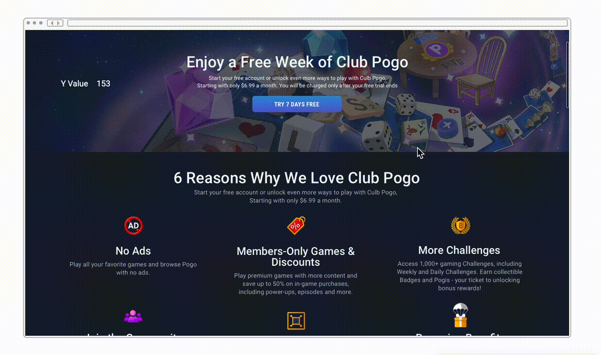
Improve the flow efficiency, consolidate the plan page and benefits page as one page.
Re-organize the content of the page, based on story telling strategy to share the context with users.
Add the welcome page for users as their last step, providing the full cycle subscription journey for users.
Provide help and documentation for users, help users understand how to complete the their tasks easily.
Provide plan selections in the check-out page, adding upsell plan in the check-out page, giving more flexibilities for users to select.
Provide help and documentation for users, help users understand how to complete their tasks easily.


Skip
if already sign-in
Error
State
Coupon
Applied
Step 1
Plan & Benefits Page
Step 2
Sign-in Page
Step 3
Check-out Plan
Step 4
Welcome Page
Wireframes & Design Explorations
I used Sketch to draw up wireframes and Proto.io to create a clickable prototype. The final MVP design (benefits page and check-out page))V.S previous design was used in A/B testing to collect feedback from users


Outcomes
After competitive analysis, flow optimization, design iterations, and A/B Testing, the research told us that the previous subscription flow was super overwhelming and confusing. It created unnecessary friction for users to finish their tasks. The subscription page, as a most important part of a business needed to simplify the process for the users.
To simplify the subscription experience for users, we decided to consolidate the previous benefits page and plan page into one single page, which would walk users through the process, help users to understand the context of the page, reduce cognitive load, scan the important information easily, and find helpful information effectively.
Besides, we added flexibilities in the final check-out page, it allows users to make edits at the final step as well as allows businesses to present the current promotion plans.
Finally, as the last step of the whole journey, we added the welcome page after users finish their subscription task successfully, the welcome page offers celebration moments based on different user stories. It also navigates users through to the next step, helping users to engage with the site.


Key Takeaways
How to provide a significant impact on a project, within a narrow time frame, through performing lean UX.
Understand complicated business rules and processes and translate those into simple actionable steps, concepts for the end-users.

Designing a consistent and delightful user experience for varying user groups with different strategies and needs.
EA Honor (Superstar 🌟)